興達港歐董_新包裝系列
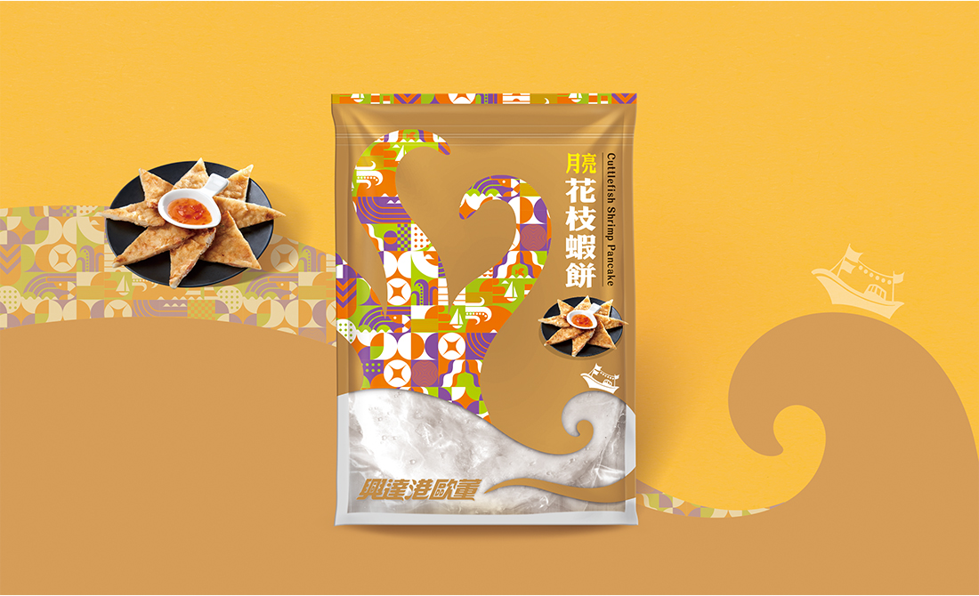
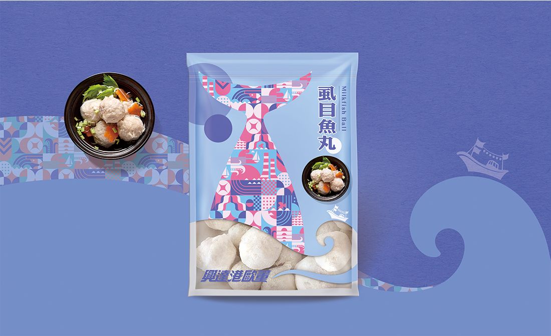
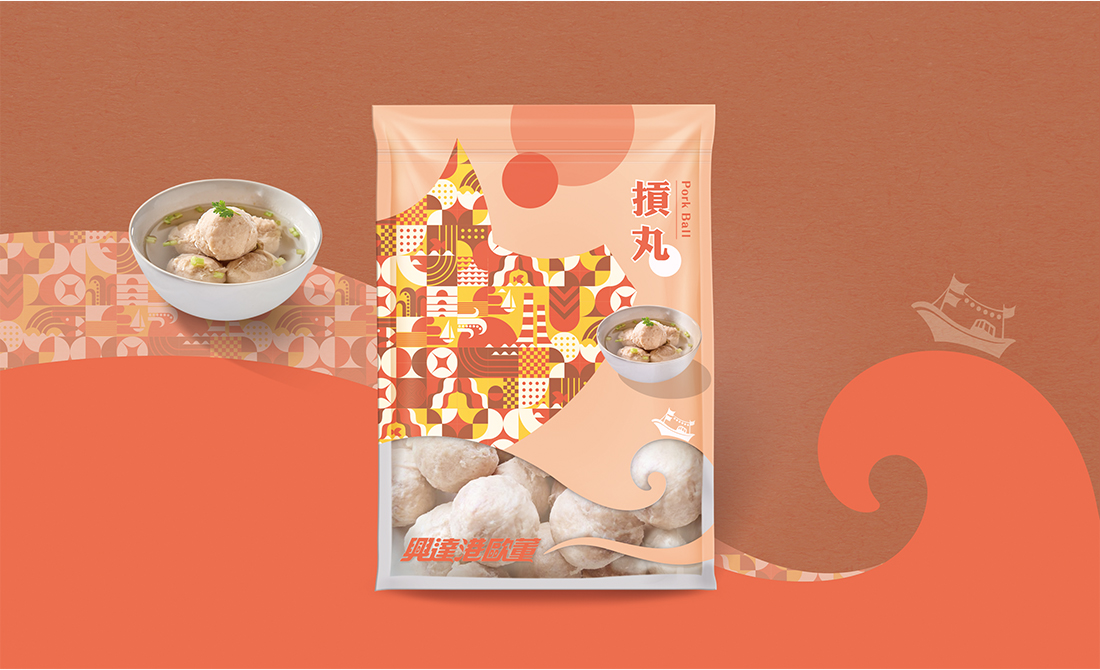
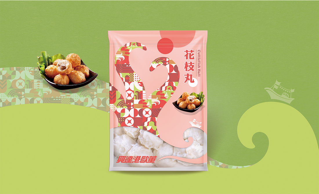
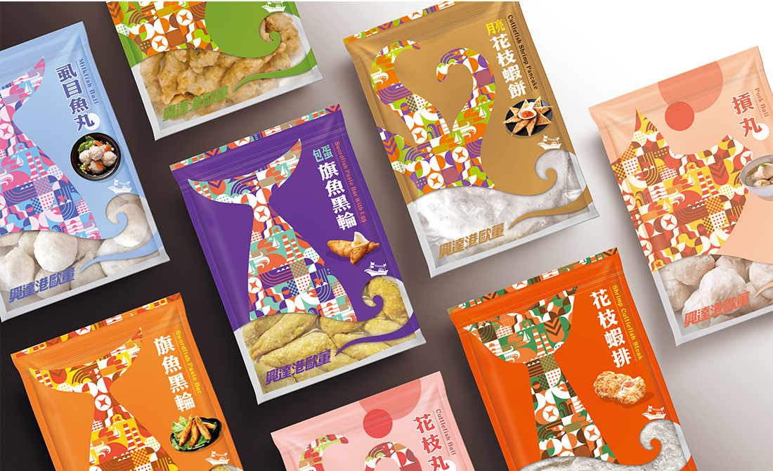
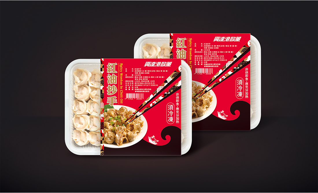
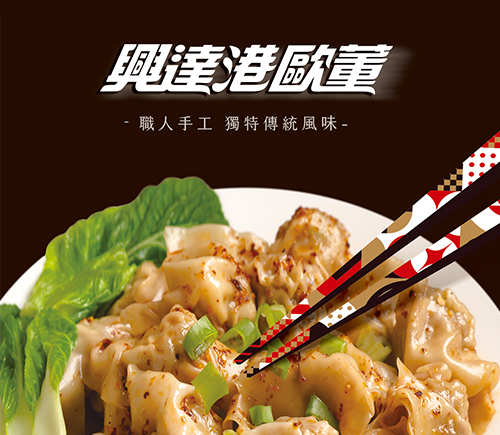
興達港歐董的包裝設計以高雄茄萣興達港為靈感,傳遞出濃厚的在地情懷與產品多樣且豐富的風味。
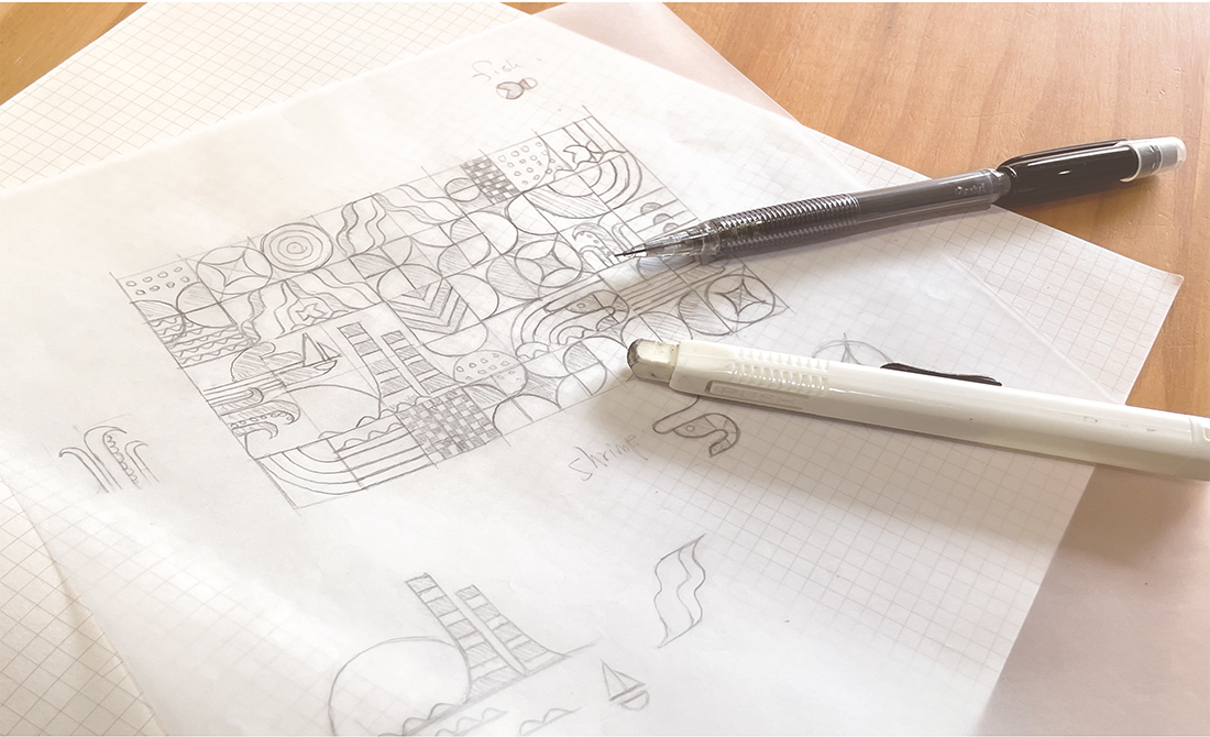
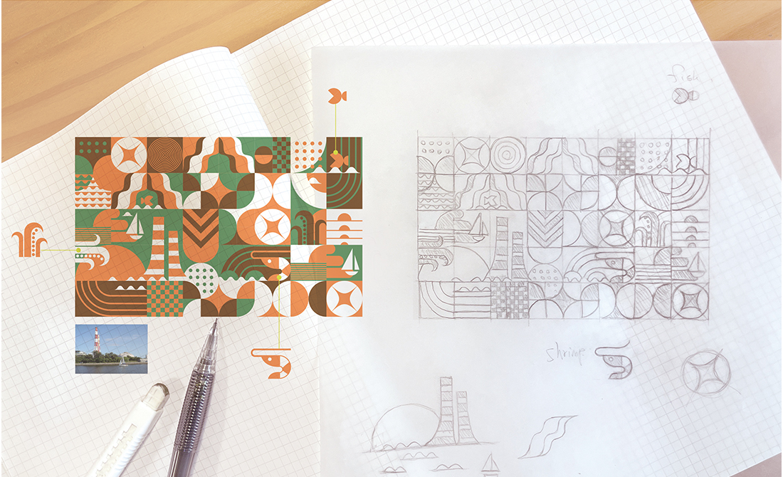
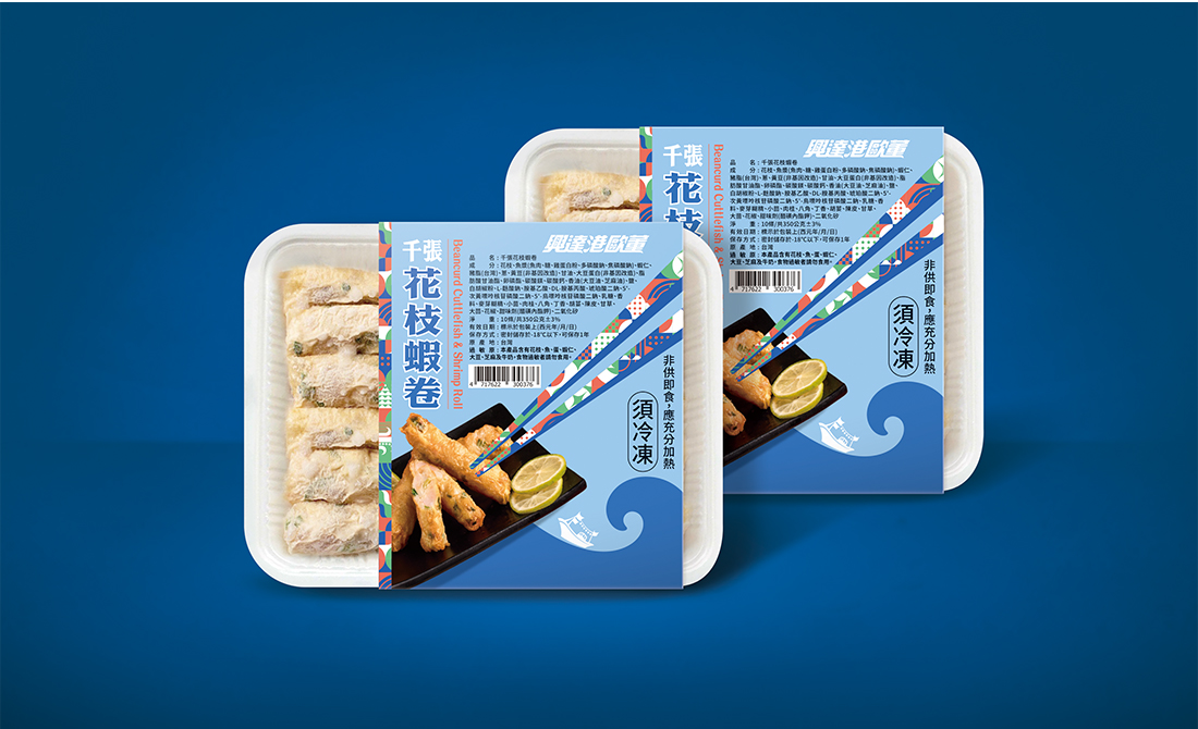
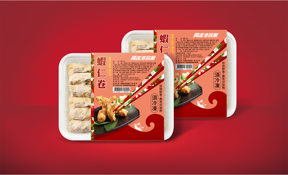
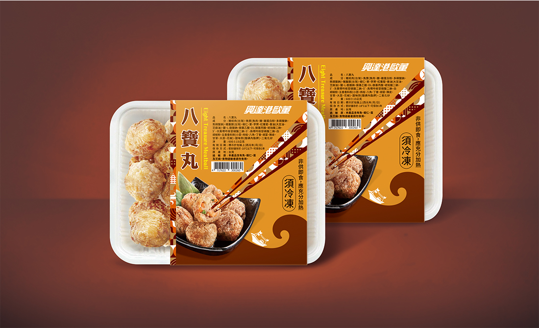
設計以興達港港口象徵性的元素,如火力發電廠煙囪、夕陽、漁船、海浪為主軸,搭配花枝、蝦子、魚等食材符號,展現品牌的產品特色與鮮度保證。整體視覺運用馬賽克手法,將這些意象融匯成充滿層次感的輔助圖案,呼應興達港漁獲的多樣性與豐富性。
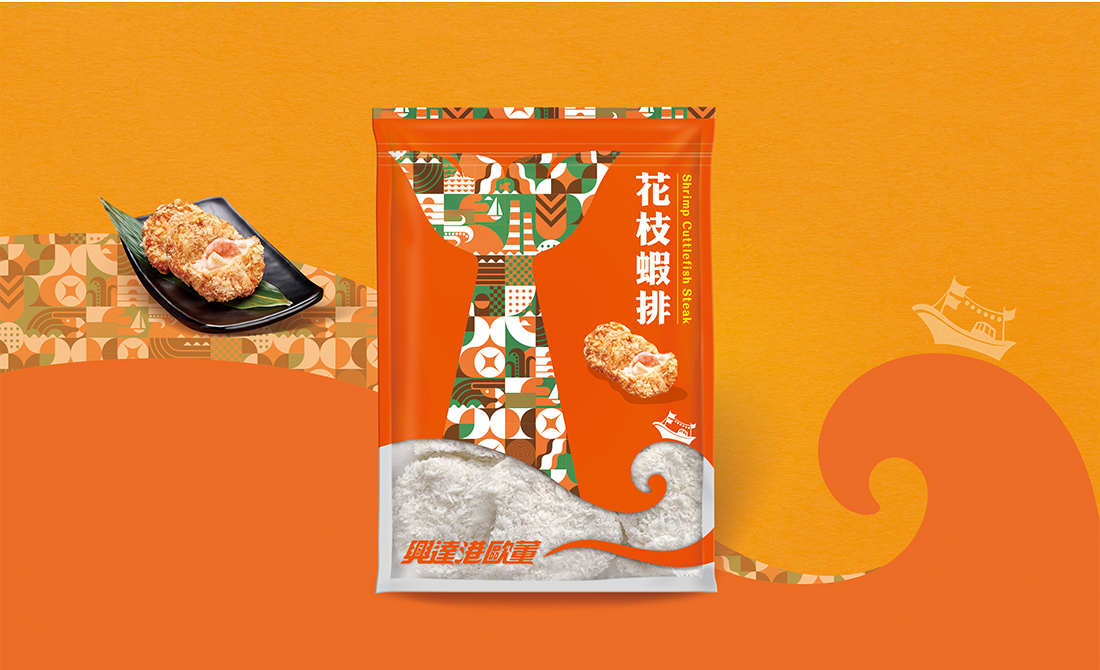
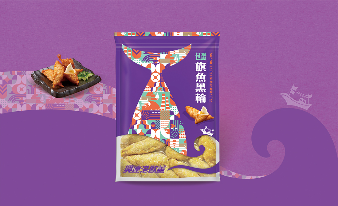
在包裝設計上,依據不同產品品類進行分類與細緻調整,例如:蝦類產品以蝦尾形狀呈現輔助圖案,強化辨識度與專屬感。包裝袋底部設計一道海浪形狀的透明鏤空,讓消費者可以直接看到產品本身,增添真實感與信賴度。整體設計不僅延續歐董老店的在地手工傳統,更以現代視覺語言賦予品牌全新活力,展現高品質與溫暖人情的雙重價值。
The packaging design of Xing Da Harbor Oudon is inspired by Xing Da Harbor in Kaohsiung City, conveying strong local feelings and the diverse and rich flavors of the products.
The design uses iconic elements such as thermal power plant chimneys, sunsets, fishing boats, and waves as the main axis, and is paired with food symbols such as cuttlefish, shrimps, and fish to demonstrate product features and freshness guarantee.The overall vision uses a mosaic technique to integrate these images into hierarchical auxiliary patterns, echoing the diversity and richness of Xing Da Harbor catch.
We classify and finely adjust the packaging design according to different products. For example, shrimp products present auxiliary patterns in the shape of shrimp tails to enhance recognition and a sense of exclusivity. The bottom of the packaging bag is designed with a transparent hollow in the shape of a wave, allowing consumers to directly see the product itself, adding realism and trust.
The design not only continues the local handicraft tradition of the Oudon, but also gives the brand new vitality with modern visual language, showing the dual value of high quality and warm human touch.


